dragonwolf
Pukovnik
 Howling with delight!
Posts: 363
|
Post by dragonwolf on Aug 16, 2014 12:09:08 GMT 1
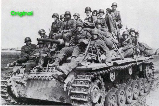
 Hey guys, What do you think of my Mod's Main Menu? This is just a preliminary look. I need to adjust and move some of the photos. I like the original picture so I thought I would just give it my own personal twist. Any suggestions? Ciao, John |
|
dragonwolf
Pukovnik
 Howling with delight!
Posts: 363
|
Post by dragonwolf on Aug 17, 2014 5:12:07 GMT 1
Thanks, Nephilim.
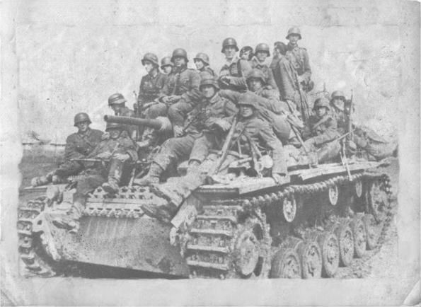
I thought about going with a more vintage look on the photos.
One problem is there's only so much room around the perimeter before you begin to cover up the main picture and I don't want to do that.
I'll experiment with the vintage look and see what I can do about adding more photos.
Ciao,
John
|
|
Deleted
Deleted Member
Posts: 0
|
Post by Deleted on Aug 17, 2014 21:01:03 GMT 1
 I a council if I may. I would place good large photo the background then other smaller ones as recommended by our friend Nephilim  Greetings friend.
|
|
|
|
Post by Major Pain on Aug 18, 2014 7:59:48 GMT 1
Let me know if you want me to advise on how to turn off the smoke loop on the tanks. This action is performed deep within the menu code... and can be changed. The code overlays part of the original background to the front of the background which makes the process a bit more tricky of you simply change the image.
Crisp photos overlaying the drawn art is somewhat a large contrast. Try turning the photos to artistic renderings using various settings. Or make the tank art out of focus and making them seem more realistic using lighting and shadows. The degree of crispness for both needs to be brought to an equal level... they should merge together in a natural way. Sometimes, removing the background from photos and mixing the rest of the photo can help blend it into the overall scheme. Do not strive for conformity or balance... it takes away from the effect. The focus is not a single aspect of the background, but the entirety.
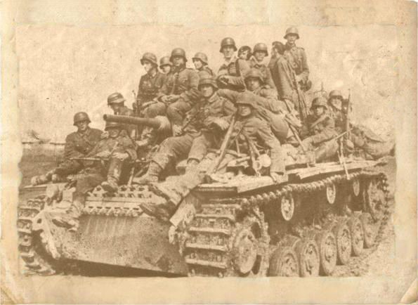
It might be better to start with a new background and add whatever you want... I recommend the sepia look (old photos) or slightly out of focus and dark shadowing... Make it stark... (harsh, empty, simple, cold) from time's past.
The work on this kind of mosaic art is wide open... and a matter of conceptual interpretation. Look at old pictures of Life Magazine from the 1940s... or Rockwell Wartime Artwork of the period.
I might mention it is hard to listen to the color-blind guy... my taste might be a little strange to others...
|
|
|
|
Post by Quintaxel on Aug 18, 2014 11:15:56 GMT 1
dragonwolf: For what it's worth, maybe you could try this link to turn to make the give the pictures a more worn effect.  Old photo effect  and with sepia effect 
|
|
|
|
Post by Major Pain on Aug 19, 2014 4:42:25 GMT 1
Simple, clean and stark... presto... very good Quin... Here's one of mine...  |
|
dragonwolf
Pukovnik
 Howling with delight!
Posts: 363
|
Post by dragonwolf on Aug 20, 2014 8:54:07 GMT 1
All suggestions taken into consideration.
Thanks guys.
Ciao,
John
|
|
tedi88
General
 Blitzkrieg State Prosecutor
Posts: 1,228 
|
Post by tedi88 on Aug 20, 2014 23:12:23 GMT 1
Major Pain would you be interested in sharing that background? Nice work everybody.
|
|
|
|
Post by Major Pain on Aug 21, 2014 6:32:03 GMT 1
tedi
I appreciate that you like it...
Of course you are welcome to it.
I'll send it over to you with some instructions on how to change your background. Which BK Title are you going to apply it to? I use it on RT/BH and the Original BK, (all Anthology).
|
|
tedi88
General
 Blitzkrieg State Prosecutor
Posts: 1,228 
|
Post by tedi88 on Aug 22, 2014 0:05:19 GMT 1
tedi I appreciate that you like it... Of course you are welcome to it. I'll send it over to you with some instructions on how to change your background. Which BK Title are you going to apply it to? I use it on RT/BH and the Original BK, (all Anthology). Sorry for late reply. To answer your question: same as you Anthology (both RT/BH and Vanilla). On the other hand I think I know how to change them, but just in case some instructions would be appreciated. |
|
|
|
Post by Major Pain on Aug 22, 2014 12:35:47 GMT 1
There is a slight change to the Menu Code to remove the smoke animation reference. I provided the step by step on how to change this.
You should have the file in your inbox...
|
|
dragonwolf
Pukovnik
 Howling with delight!
Posts: 363
|
Post by dragonwolf on Aug 23, 2014 17:30:01 GMT 1
Sorry. Didn't get it.
|
|